Colour as Architecture
The professional use of colour is an ideal method to emphasise positive experiences. At Microcrete Techniques, we understand that light quality, tactile properties, and colour all profoundly influence how we perceive and experience spaces. Our colour system helps designers and applicators achieve perfectly harmonious environments.
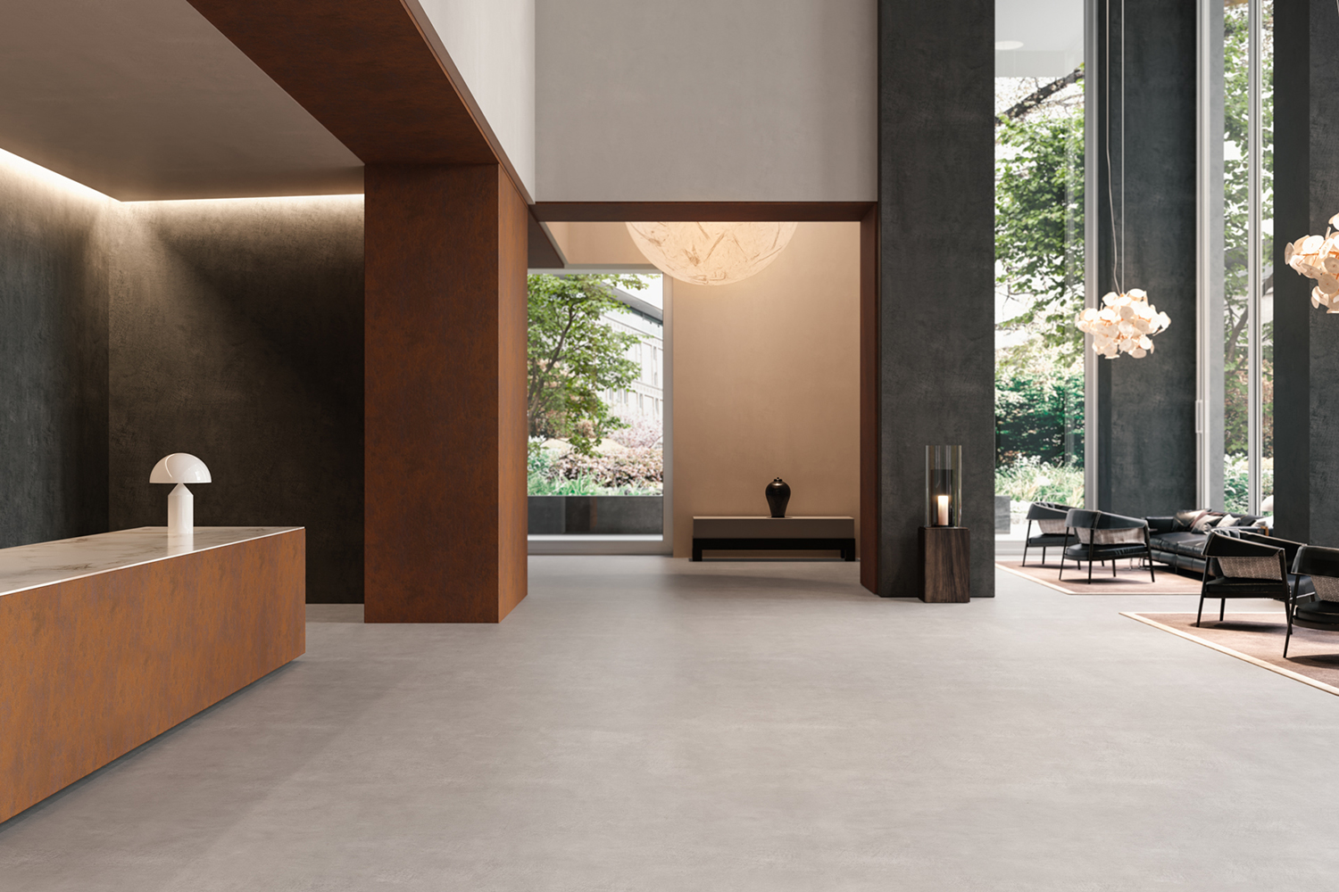
A Matrix of Five Colour Ranges
Our colour palette is organised as a matrix of five ranges — from light/soft through grey/dark to intense through to pastel shades. Two reading directions: horizontal for tone-on-tone combinations; vertical for same-colour-strength combinations.
Warm, luminous tones from cream to golden ochre
Earthy, terracotta tones from sand to burnt sienna
Bold tones from dusty rose to deep burgundy
Cool tones from pale stone to deep slate
Natural tones from sage to forest
The Art of Harmony Catalogue
Download our complete colour system catalogue to explore all available combinations for Microtopping®, Lixio®, and our full product range.
Download Catalogue